
Interior wall paint is the first thing people notice when they walk into a room. The right color can make a flat, uninspiring space feel comfortable and inviting. Current design trends lean on natural, earthy colors: warm neutrals, greens, browns, and blues.
Major U.S. paint brands have built their 2026 collections around these shades. Sherwin-Williams, Behr, Benjamin Moore, Valspar, Glidden, and Dutch Boy all named a Color of the Year, and most of them are warm, grounded, and easy to live with.
Table of Contents
ToggleWith so many options, choosing can feel overwhelming. Below are nine popular colors, where they work best, and how to use them. We also cover costs, safety, and a quick look at what is coming in 2027.
What Interior Paint Colors Are Trending in 2026?
In 2026, homeowners are trading harsh, high-contrast looks for softer shades that feel cozy and calm. A single bold color then adds visual interest.
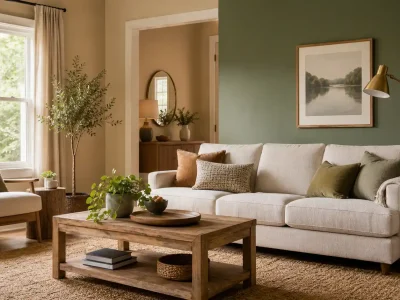
Mellow browns, muted greens, deep blues, and creamy neutrals are leading the way. Another clear shift is toward colors that complement the natural surroundings. Textured upholstery, warm metals, stone finishes, and wood furniture all pair well with this year’s palette. Most homes use a group of related shades instead of sharply contrasting ones, which gives a smoother flow from room to room.
Most Popular Interior Paint Colors to Consider in 2026
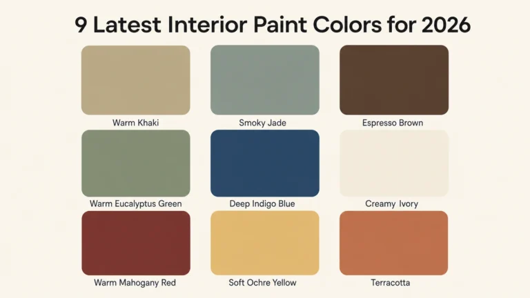
Here are nine paint colors that show where color trends are heading. Some are official Colors of the Year, and others are classic shades that work well alongside them.
1. Warm Khaki: A Modern, Organic Neutral
Universal Khaki (SW 6150) was named Sherwin-Williams’ 2026 Color of the Year. It is a mid-tone neutral with a slight yellow undertone, so it feels warmer than beige and softer than gray. It suits living rooms, kitchens, and dining rooms. Sherwin-Williams suggests pairing it with Cream and Sugar (SW 9507) for a soft, layered look.
2. Smoky Jade Green
Hidden Gem (N430-6A) is Behr’s 2026 Color of the Year. It sits between blue and green, with enough warmth to keep it cozy. Use it on a feature wall in a living room, or in a home office where you want a calm, focused mood. It looks good with natural wood, warm whites, and brass or gold accents. In a small room, painting just one wall keeps the color from overwhelming the space.
3. Espresso Brown
Benjamin Moore chose Silhouette (AF-655) as its 2026 Color of the Year. It is a deep espresso brown with subtle charcoal notes. Dark colors like this absorb a lot of light, so they work best in rooms with good lighting. The same Benjamin Moore palette includes Swiss Coffee (OC-45), a soft, creamy white that makes a good partner for trim or adjoining walls.
4. Warm Eucalyptus
Valspar’s 2026 Color of the Year is Warm Eucalyptus (8004-28F), a muted green with a slightly vintage feel. It is restful enough for bedrooms and versatile enough for living areas. Valspar suggests pairing it with Degas Blue (8004-35B) or Groundbreaking (8005-8F), a deep brown with gray notes.
5. Deep Indigo Blue
If you want a stronger blue, Sherwin-Williams Indigo Batik (SW 7602) is a good example. It is a deep, muted blue with a very low light reflectance value (LRV) of about 8, so it reads dark and dramatic. It works well on an accent wall, in a dining room, or on a front door. For a softer option, try Degas Blue (8004-35B), a light blue with hints of green and gray.
6. Creamy Ivory
Dutch Boy named Melodious Ivory (313-2DB) is the 2026 Color of the Year. It is a soft, creamy beige with a gentle peach undertone. Because the undertone leans warm, test it in your own lighting before committing. It works in almost any room, including bedrooms, hallways, kitchens, and living rooms. It looks especially good with brass fixtures, natural wood, and beige or neutral decor, and it helps create a consistent look from room to room.
7. Warm Mahogany
Glidden named Warm Mahogany (PPG1060-7) its 2026 Color of the Year. It is a rich red with brown undertones, and one of the boldest choices on this list. It suits dining rooms, bedrooms, and libraries, where a deep color creates a cozy, intimate feel. Glidden suggests balancing it with cream, blush, or greenery. You can also use it as a feature color against lighter neutral walls, with white, beige, or metallic accents to offset the depth.
8. Soft Ochre
C2 Paint chose Epernay (639) as its 2026 Color of the Year. It is a pale, earthy ochre with subtle mineral undertones, a refined and warm yellow. It works well in kitchens and dining rooms. Pair it with cream, brown, and natural wood, and use it in moderation for a warm but not overpowering effect.
9. Terracotta
For anyone who loves earthy colors, terracotta adds warmth fast. Sherwin-Williams Henna Shade (SW 6326), part of its 2026 palette, is a warm terracotta with a clay-like depth. It looks good with cream, olive green, and natural wood tones.
How to Choose the Best Paint Colors for Different Rooms
Picking a color is only the first step. The final look depends on how you use the room, how much natural light it gets, and the finishes and furniture already in place. A color that looks lively in a bedroom can feel dark in a living room.
Warm neutrals and creams work well in living rooms, where the walls act as a quiet backdrop. Bedrooms usually call for softer, calmer colors, and cool blues and greens are popular there. Dining rooms can handle stronger, earthier tones.
Living Room
Warm khaki, ivory, soft blush, and sage green are all reliable choices for living room walls. For a bolder look, paint one feature wall in a darker shade such as smoky jade or indigo, and keep the other walls in a lighter version of the same color family.
Kitchen and Dining Room
Warm, clean colors work well here. Ochre, warm white, olive green, and beige all feel fresh and inviting. Choose a durable finish, such as satin or semi-gloss, that can handle scrubbing. This matters most in the kitchen, where walls get splashed and marked with food.
Practical Tips for Choosing Modern Interior Paint Colors
Before you commit to a trending shade, ask whether it suits your home, your style, and the way you live. These points can help:
- Natural light: Notice where light falls during the day and how it changes the color. North-facing rooms tend to look cooler, and south-facing rooms look warmer.
- Room size: In small rooms, a lighter color usually feels more open. Very dark colors work best in rooms with good lighting.
- Furniture and fixtures: Choose undertones that match your flooring, drapery, cabinets, and soft furnishings.
- Samples: Test large sample patches or peel-and-stick samples on the wall, and look at them in the morning and in the evening.
- Finish: Matte hides wall imperfections, eggshell suits most living areas, and satin or semi-gloss holds up better in kitchens, bathrooms, and on trim.
- Palette: Choose two or three colors for each main area so the rooms feel connected.
How Much Does Interior Painting Cost?
In 2026, professional interior painting in the U.S. generally costs about $2 to $6 per square foot. According to Angi data reported by NerdWallet, the average homeowner spends around $2,000 on an interior paint job. Most projects fall between roughly $1,000 and $3,000 or more. Your final price depends on:
- Ceiling height and room size
- Wall condition and prep work
- Whether trim, ceilings, and doors are included
- Paint quality
- Local labor rates
Dark or dramatic colors can need extra coats or a tinted primer, so ask your painter about this when you get a quote.
Benefits of Professional Interior Painting
Poor prep or low-quality paint can make it hard to get even coverage. Professional painters know how different surfaces respond to paint and use techniques that produce a smooth, consistent finish. They can also color-match, recommend the right product and sheen, and help you avoid costly mistakes.
Lead Safety in Older Homes
If your home was built before 1978, it may contain lead-based paint. Under the EPA’s Renovation, Repair and Painting (RRP) Rule, anyone paid to disturb painted surfaces in a pre-1978 home must be certified and trained in lead-safe work practices. The rule generally does not apply to homeowners working on their own homes, but lead-safe practices are still a good idea. You can learn more and find certified firms at the EPA’s lead-safe renovation resource page.
Low-VOC Paint and Indoor Air Quality
Many paints release volatile organic compounds (VOCs) that can affect indoor air quality. Low-VOC and zero-VOC paints reduce this, which matters most in bedrooms, nurseries, and home offices. Labels can be misleading because colorants added at tinting can raise a paint’s VOC level, so ask for low-VOC colorants.
Some states, including California, enforce stricter VOC limits than federal rules. Whatever paint you choose, keep the room well ventilated while you paint and for several days afterward. See the EPA’s guidance on VOCs and indoor air quality.
Rentals and HOAs
If you rent or live in a community with a homeowners association, check your lease or HOA rules before choosing a color.
SD Custom Painting focuses on careful prep, quality materials, and a clean finish, whether you are painting one room or a whole property. To request a free estimate in San Diego, CA, call (619) 464-4030 or visit SD Custom Painting.
A Quick Look at 2027
Several brands have already announced their 2027 colors, and greens lead the way. Sherwin-Williams chose Celery (SW 6421), a soft, muted green with yellow undertones. Behr picked Grounded, a warm olive. Benjamin Moore named Webster Green (HC-130), a classic forest green. Valspar selected Cottage Door (8004-38E), a mid-tone blue. If you are planning a repaint for next year, the 2026 shades above still work well, and they pair easily with these newer greens.
Conclusion
From warm khaki and creamy ivory to terracotta, smoky jade, and deep indigo, this year’s colors add warmth and character to a home. The best choice depends on your lighting, your furniture, the size of the room, and your personal style. Pick colors you will enjoy for years rather than ones that only follow the trend. Good paint, careful prep, and proper application matter just as much as the color itself, and SD Custom Painting can help with all three.
Frequently Asked Questions
Is the Color of the Year safe to use on walls?
Usually, yes. Colors of the Year are regular, widely available paint shades. They are trend picks, though, not a rule, so the color still needs to suit your home, your lighting, and your style. Test a sample on the wall before you buy.
Can a professional painter help me choose a color?
Yes. A painter can help you test several colors and recommend the right paint type and finish for each room.
How much does it cost to paint the interior of a house?
Professional interior painting typically runs $2 to $6 per square foot, with many homeowners spending between $1,000 and $3,000 or more, depending on the size of the home, prep work, and paint quality.
Is low-VOC paint worth it?
For most interior projects, yes. Low-VOC and zero-VOC paints produce fewer fumes, which is helpful in bedrooms and poorly ventilated rooms. Ask about low-VOC colorants too, since tinting can add VOCs back in.
Do dark paint colors need extra coats?
Often they do. Deep shades like espresso brown or indigo may need a tinted primer or an extra coat for even coverage. Your painter can advise on this.