
Right now, interior painting is not just a trend. It is actually about blending the color into your home’s design, your floors, and your lighting—not just your décor. Whether you prefer to keep it all light or always have a tendency for the more peaceful pastel tones, nature-inspired browns and greens, or the bolder darker colors, a professional interior painting contractor can help you decide what’s best for your living space.
We’ve narrowed down the ten hottest colors for paint and let you know where you should be using them, and we’ve even given you the scoop on how to make the flow between rooms. Keep your home always looking its best for years to come—whether you’re upgrading one room or changing out every room in the house.
Table of Contents
Toggle1. Warm White: A Bright and Timeless Choice
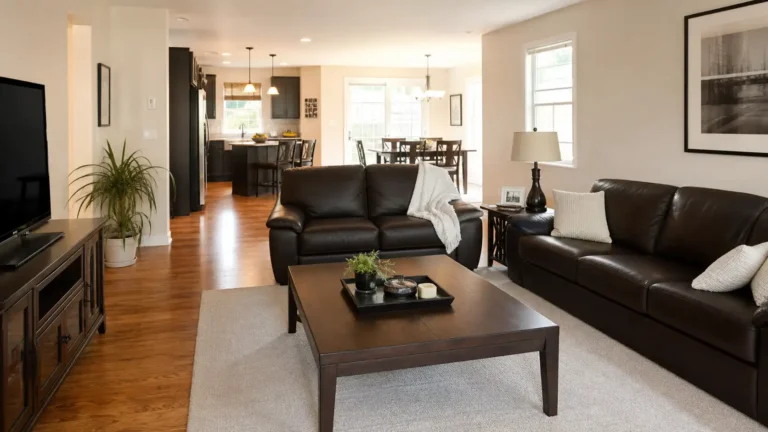
Warm white offers your room a fresh, clean feeling that’s more inviting for those in the room but perhaps not quite as cold. With that slight hint of yellow, beige, or cream in the hue, it provides a warmer, more inviting atmosphere, as though sunshine is pouring into the space. Great in your lounge, hallways, bedrooms & open-plan areas.
Of course, this would be a major reason why warm white is one of the most popular paint colors around, particularly if you consider that it can be used with furniture made from wood or stone, a neutral color palette, as well as many other types of décor, such as country or contemporary décor.
Where Warm White Works Best
In rooms that should appear lighter and more spacious, utilize warm white. It will make rooms look more open and is ideal for darker furniture, providing contrast without being overly stark.
Test your samples against your flooring and trims before selecting a color. Certain whites are more likely to lean warm yellow under artificial light. Depending on the time of day, some whites can look more gray than you like if a room faces north.
2. Soft Beige: Comfortable and Sophisticated
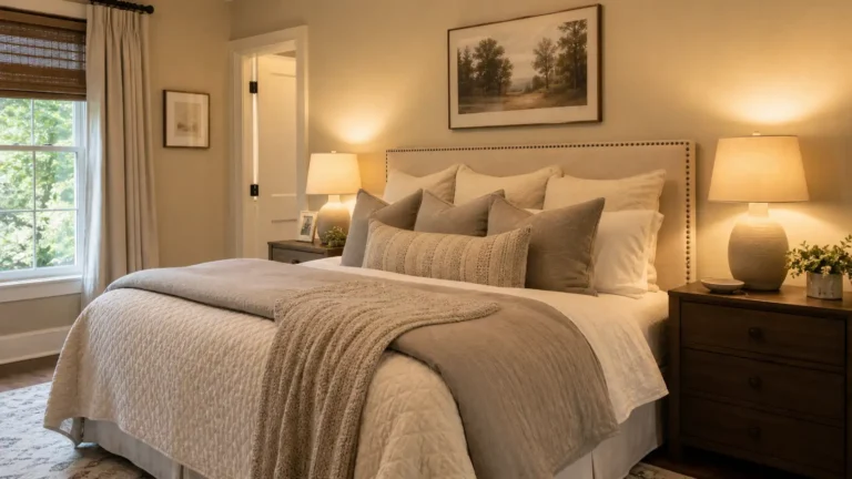
You can use this in several rooms. On the one hand, beige can form a welcoming atmosphere for family rooms and living rooms. On the other hand, it offers a neutral base that can be combined with multiple layers of bedding and various lighting fixtures in the bedroom.
How to Style Beige Walls
Notice the undertones of your wall color and the undertones in your finishes when coordinating colors. Pinkish beige could read completely differently in the presence of a golden oak floor, while a more neutral beige could work well next to gray stone.
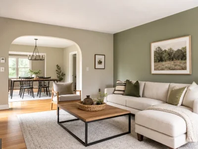
3. Sage Green: A Calm, Nature-Inspired Shade
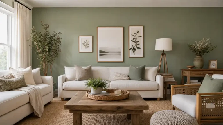
Sage green has been popular in recent years in terms of interior design, and it’s not hard to see why. It’s a softer infusion of nature into a room, and its muted color is suitable for those who want a little bit of green in their house rather than plain white or a neutral hue.
Creating a Balanced Sage Green Interior
Use sage throughout the whole wall, or if you are after a softer look, use it on just a feature wall; allow the white ceiling to lift the tones and bring softness and natural texture!
Learn the Light: Observe the color in dark areas, since brighter, greener shades tend to look duller and darker there. If you want to retain a lively, fresh personality without losing your tone of color, consider a lighter sage hue.
4. Greige: The Best of Gray and Beige
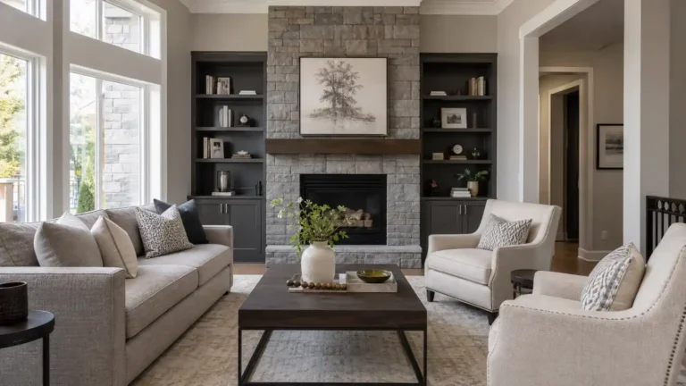
Greige: Gray and beige in one. Greige is a neutral that works with just about everything. It’s the neutrality of gray but has that warm hue of beige, so if you’re a homeowner who can’t go too gray, this could be the color for you!
Choosing the Right Greige Undertone
Some greige will have both beige and gray undertones within the tones. You will select the greige color based on whether you use a warm or cool color tone on your countertops, flooring, furniture, and the lighting within the room.
5. Dusty Blue: Relaxed and Refreshing
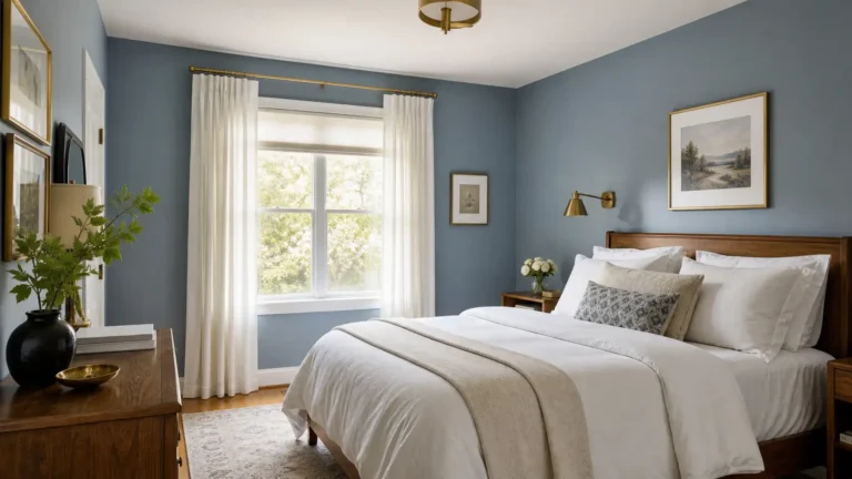
Dusty blue can be a beautiful way to add a pop of color that won’t be as loud as some of the brighter colors. It has a classic look to it that will work in contemporary and traditional decorations.
The color is super relaxing in a bedroom thanks to its earthy hue, but looks amazing in a bathroom, office, or living room, or as a more neutral option.
Compatible Colors For A Dusty Blue
Complement it with bright white, soft beige, light gray, or wood furniture to highlight this color. Balance it out with accents of deep navy blue or introduce some brass or brushed metal accents.
Look carefully at the color you have chosen in different lighting before painting all the rooms in your house this blue. Some shades are more yellow-based and are thus better suited to bright filtered light. Meanwhile, cooler undertones might appear if you use this in shadowed interiors.
6. Terracotta: Warmth With Character
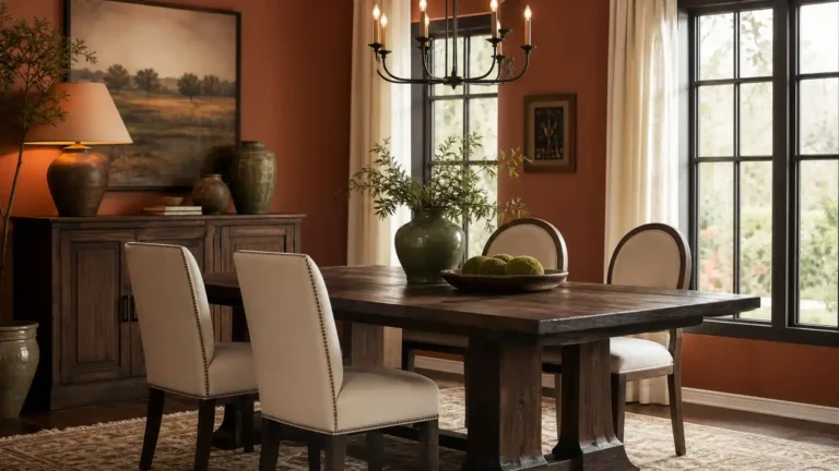
The terracotta color palette is a very warm and earthy color palette that would be perfect for your home if you are looking for a friendly, inviting feel.
This one can be applied in dining rooms, living rooms, entrances, and as decoration in some rooms. If it’s combined with cream color, sand, olive-green shades, dark wood, or woolen textured materials, it is able to serve as a perfect contrasting background and create a warmer feeling.
Using Terracotta Without Overwhelming a Room
If you worry terracotta will be too bold for your residence or you are still fairly new to working with bright and bold colors, choose a less saturated option.
7. Charcoal Gray: Bold and Contemporary
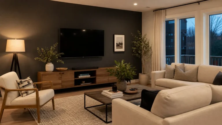
A deep, rich, and bold color that provides intensity to a room and an elegant modern feel. It is a very deep shade of gray that will provide a subtle contrast to define artwork, furniture, and even architecture.
This is a great color for an accent wall in the living room, or a headboard wall in the bedroom, or an office when you’re trying for a tighter, elegant appearance. Charcoal can also be used over an entire room if it’s large enough and you have plenty of light and light furnishings so it isn’t cave-like.
How to Balance Dark Walls
Contrast the charcoal with the warmth of white, pale gray, or beige. Use candles and/or window coverings to combat that dark room syndrome.
Choose a lighter gray for a small room with little sunlight. For a darker look, paint one wall in medium to dark charcoal gray, but don’t use a dark shade that will make your room feel small.
8. Muted Olive Green: Rich and Natural
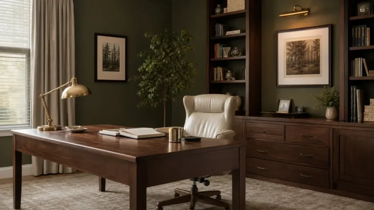
If you want a softer tone of olive, you can go for muted olive. It’s more earthy and makes the space feel more natural and unique.
A rich color for the lounge, dining room, study, or bedroom where you want to be bolder. Works well with walnut furniture, cream-upholstered leather furniture, and stone.
Making Olive Green Work With Your Décor
Try a color family. Keep the overall scheme muted for harmony, using olive green and warm neutral tones. Cream trims and paler fabrics work well with this level of color depth, but brass or black are just as effective.
You may desire a lighter shade of this olive if you are going to use it in a small room, or you can paint one wall of your room this particular color.
9. Pale Lavender: Soft and Unexpected
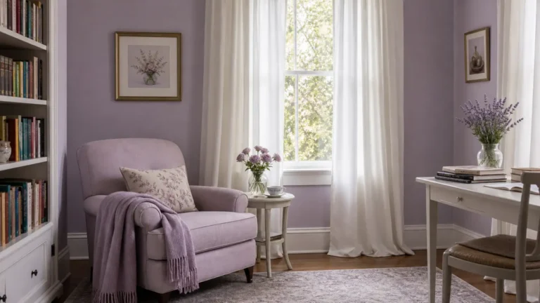
Pale lavender is the gentlest of the lavender colors, with an extra hint of blue, beige, or white added to true lavender. It gives your home a soft feeling of freshness and peace. Use it in a bedroom, craft room, reading room, or dressing room.
Choosing a Sophisticated Lavender Shade
How can color change the way my room looks? Light lavender paint can look lighter or darker depending on whether it is on a wall, a paint chip, or a sample card. The undertones of the lavender will be pink or blue. Check light lavender against a curtain, floor, or sofa fabric.
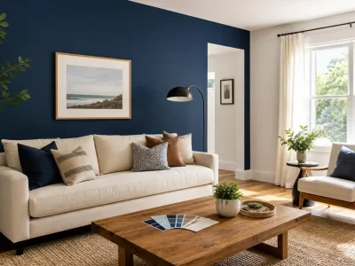
10. Deep Navy: Sophisticated and Bold
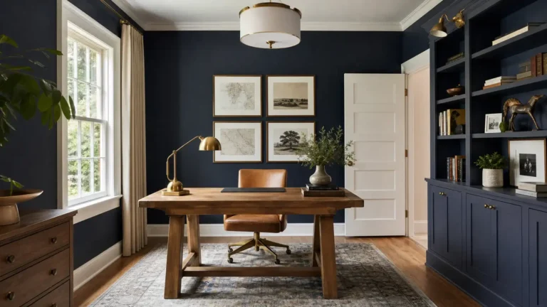
However, if you like a little more drama and a bit more class, then you can never go wrong with deep navy. It will add some dimension to your room, as well as bring out your best furniture, artwork, and metals.
Navy suits a study, lounge, living area, bedroom, or home workplace. Its tie-in with warm white hues, beiges, natural woods, and brass accents allows you to develop various interesting variations of a theme.
Navy Interior Styling
Keep it subtle by painting one wall navy and leaving the rest of the room light. You might also want to paint a couple more walls the same color in a large bright room for some extra cocooning.
Don’t choose navy from a small color chip alone!
The Significance of Expert Interior Painting
Paint quality matters little unless the wall is prepared well. The cracks, spots, and imperfections on the surface, the unpainted areas, and the rough finish would be visible when the paint is dark or glossy.
For better indoor air quality, ask about low-VOC paints; the EPA explains how volatile organic compounds affect indoor air. If your home was built before 1978, also review the EPA’s lead-safe renovation and painting rules before any sanding or scraping begins.
As you begin a house painting task, SD Custom Painting will certainly make the best plan possible, considering paint color, surface, and design prep work that will complement the interior of your house. You might find that you intend to update one area or a number of spaces; with the correct planning, the outcomes can be much more satisfying.
Conclusion
Color is one of the most affordable home décor ideas to make your spaces and all of the other elements in the house reflect your style. These color ideas include off-white, beige, greige, sage green, pale lavender, terracotta, navy blue, charcoal gray, olive green, and dusty blue.
Popular Colors for Wall Paints: The interior wall paint colors that are most popular aren’t the “it” colors of today that won’t be in next season. They’re simple, dependable hues that complement your furniture, lighting, and other parts of everyday living.
Explore the colors in person, get familiar with the rooms and their building blocks, and prepare your house before working on each room. For a beautiful, professionally completed look and a well-thought-out renovation, let us paint your ideas into reality!
FAQs
Is it OK to paint all rooms the same color?
Not necessarily. Using a neutral across all the connecting rooms and leaving the transition seamless can work, but bedrooms, studies, and dining rooms may deserve a different tone. To help transition from one to the next, undertone matching can work.
How frequently do you need to paint interior walls?
Not every home has the same schedule. Repainting depends on a few factors, which are: the main material, the strength of the sun, ventilation, the kind of paint, and the state of use of the room. A guest bedroom may not require as much paint as a children’s room.